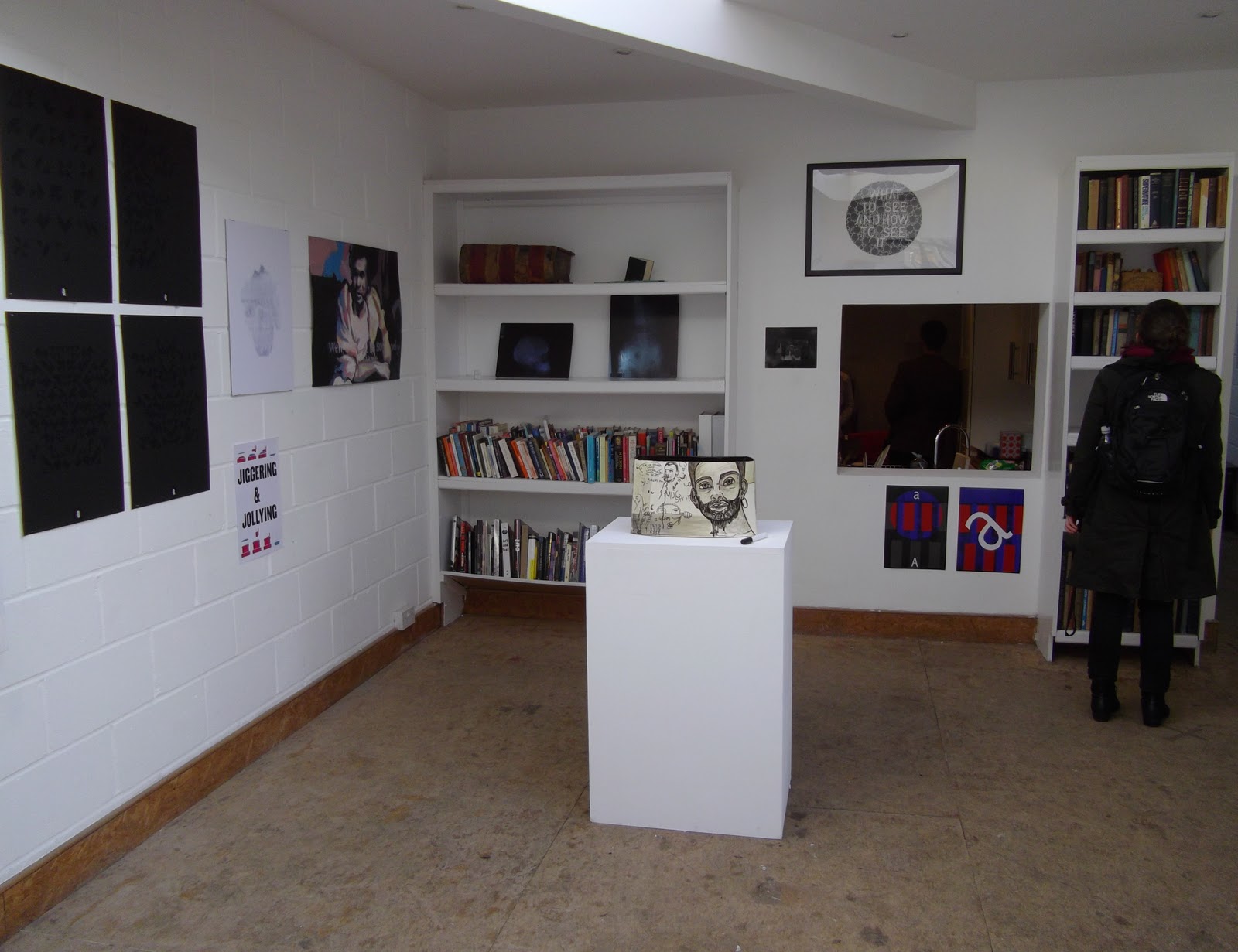
photos of our exhibition in Flat Time House
Showing posts with label TEXTandIMAGE. Show all posts
Friday, 21 January 2011
Wednesday, 19 January 2011
Tuesday, 18 January 2011
SMASHED
the glass cracked in the frame I JUST BOUGHT. I am very upset. but I will have to display the photo without...
Monday, 17 January 2011
Untitled (Shakespeare)
...the three cropped photos of my drawing-
I am going to get the middle one printed to A2... I think it looks the best quality and I like the large space of bare latex at the bottom, it makes the dark marks appear more precarious, reflecting the ephemeral nature of the drawing.

For the show...
the plan-
Untitled (Shakespeare), 2010
framed digital photographic print and caption
(frame) 73 cm x 103 cm (image) 59.4 x 42.0 cm (A2)
Due to it's ephemeral nature, most of my work exists as documentation (such as this photo). Untitled (Shakespeare) is a photograph of a drawing made in graphite dust spread over sheet latex. I created the marks and patterns by pressing and moving my body behind the latex screen. Usually I am interested in creating ambiguous images. However in this piece, inspired by a recent lecture on reading drawings, by Stephen Farthing, and my learning during this text and image elective, I have used a caption to direct the viewer's 'reading' of the image.
Friday, 14 January 2011
John Hilliard
John Hilliard, Cause of Death?, 1974
Cropping and changing the title/caption the photo to change the way we interpret the image. Here Hilliard highlights different parts of the environment to suggest how the bird could have died.
this link has a piece of writing called-
Thursday, 13 January 2011
Raymond Pettibon
We looked at the work of Raymond Pettibon in our lecture today, he was a very prolific artist and liked to almost act like a machine churning out work so that the 'artness' of his work was lost, as he was very interested in industry etc.
I really enjoy the humour and the roughness in his work.
Yet again text and image crop up! Captions very much embellish the humour of Pettibon's drawings, often the text is essential for us to understand what the drawing shows.
"No title (It sure helps)" 2002 Ink and watercolor on paper 30 x 22 1/2 inches
Pettibon, Raymond & Josh Bayer. NEW WAVY GRAVY 2 (AS OPPOSED TO OLD WAVY GRAVY): BY RAYMOND PETTIBON. Lawndale, CA: SST Publications, 1985. First Edition 1/500. 8vo. Stapled Xeroxed Wrappers. Artists' Book
Thursday, 9 December 2010
John Latham
We are using flat time house for our Text and Image show in january
I took a few photos of the exhibition space we'll have...
John Latham was the resident artist there
He worked with books and developed a theory called 'Flat Time Theory'
I took a few photos of the exhibition space we'll have...
John Latham was the resident artist there
He worked with books and developed a theory called 'Flat Time Theory'
Friday, 26 November 2010
Flat Time House
we may potentially be exhibiting in flat time house, a gallery set up in the home of John Latham. This could be a great opportunity to create site specific work...
Farthing
Royal Academy of Arts
“Artists’ Laboratory 02, Stephen Farthing RA”
Stephen Farthing RA, 'Boucher: The Back Story', 2010. Oil on canvas, 207 x 173 cm
Stephen Farthing RA, 'Boucher: The Back Story', #2 2010. Oil on canvas, 207 x 173 cm
this painting makes me quite angry.
the gaudy colours.
the text and image have melded into an incoherent mush.
Wednesday, 24 November 2010
Tuesday, 23 November 2010
Friday, 12 November 2010
Graphic Novels
The first self-proclaimed graphic novels were published from 1976-1978.
Sin City, Frank Miller (2001)
The film adaptation released April 2005 was co-directed by Robert Rodriguez and Miller with 'special guest director' Quentin Tarantino.
Reference to propaganda- images of glory and power.
Extreme violence.
I think it is easier to accept such horror when presented in a static image as it appears less real and naturally drawings are some-what removed from reality.
Battle Royale
(April 2006)
Originally a novel by Koushun Takami, Battle Royale was then adapted into movie by Kinji Fukasaku. Following the popularity of the movie, Takami worked with artist Masayuki Taguchi to adapt it into a Manga.
Early comic books were primarily comedic- they illustrated comical shenanigans. But there has always been an adult nature to the world of comics, nit necessarily through violence or sexual nature, but in language and subject. The beauty of the comic book format is that images are universal and can be understood by all ages, even if certain layers of meaning may not be grasped by a younger reader.
Saturday, 6 November 2010
Analysing Image& Text
Bob and Roberta Smith
'Bomber Harris was a Woman'
I cannot find an image, but the piece is a a woman in military uniform standing next to a some sort of trailer (the mobile reality creator) on which is painted, in bold brightly coloured letters, the slogan 'Bomber Harris was a Woman, Act Normal'
'Bomber Harris was a Woman'
I cannot find an image, but the piece is a a woman in military uniform standing next to a some sort of trailer (the mobile reality creator) on which is painted, in bold brightly coloured letters, the slogan 'Bomber Harris was a Woman, Act Normal'
Saturday, 30 October 2010
Haunch of Venison
Loud Flash was an exhibition of Punk posters from the start of the punk revolution in 1977, incidentally this coincided with the Queen's Jubilee.
After compiling a 'checklist of punk' using the posters on show as sources I felt there was definitely something very 'un-punk' about the exhibition- each poster encased in a plastic wallet arranged in fairly neat rows in a crisp white space. I think the show would have had much more impact viewed in the dingey basement of an old pub or in a derelict factory... but it was interesting to see the rebellion smothered in this space.
Thursday, 28 October 2010
about B-movies
After watching a few examples of
history-
B movies had their heyday during the 50's where it was conventional to show a short, low budget movie before the longer main feature. This
history-
B movies had their heyday during the 50's where it was conventional to show a short, low budget movie before the longer main feature. This
VERB LIST
Richard Serra's verb list
to roll to crease to fold to store to bend to shorten to twist to dapple to crumple to shave to tear to chip to split to cut to sever to drop to remove to simplify to differ to disarrange to open to mix to splash to knot to spill to droop to flow | to curve to lift to inlay to impress to fire to flood to smear to rotate to swirl to support to hook to suspend to spread to hang to collect of tension of gravity of entropy of nature of grouping of layering of felting to grasp to tighten to bundle to heap to gather | to scatter to arrange to repair to discard to pair to distribute to surfeit to compliment to enclose to surround to encircle to hole to cover to wrap to dig to tie to bind to weave to join to match to laminate to bond to hinge to mark to expand to dilute to light | to modulate to distill of waves of electromagnetic of inertia of ionization of polarization of refraction of tides of reflection of equilibrium of symmetry of friction to stretch to bounce to erase to spray to systematize to refer to force of mapping of location of context of time of cabonization to continue |
My list of words relating to my work
| trapped surrounded enveloped encased covered wrapped masked cloaked smothered hidden concealed disguised altered deformed deconstructed blurred constrained imprisoned contained | escaping emerging growing reaching pushing pressuring forcing breaking stretching smuggling fighting writhing surfacing |
Sunday, 24 October 2010
I LOVE YOU
I picked up a nice addition for my bedroom too...
I carried the heart (like this bear) from the river to London Bridge station and took it on the train home to Hither Green.
It's amazing how simply seeing a love heart shape can trigger such a loving response from complete strangers.
I feel my experience today was quite relevant to my elective... A heart is a symbol or expression of love, so generates a positive reaction. I would have been given the same sort of attention had I been carrying a smiley face or thumbs up etc, where as a big red 'X' or a skull and cross bones conjures a completely different reactions- they carry more negative set of connotations... I am slowly reading through a book on semiotics for beginners, so I will try and analyse this further...
Subscribe to:
Posts (Atom)


